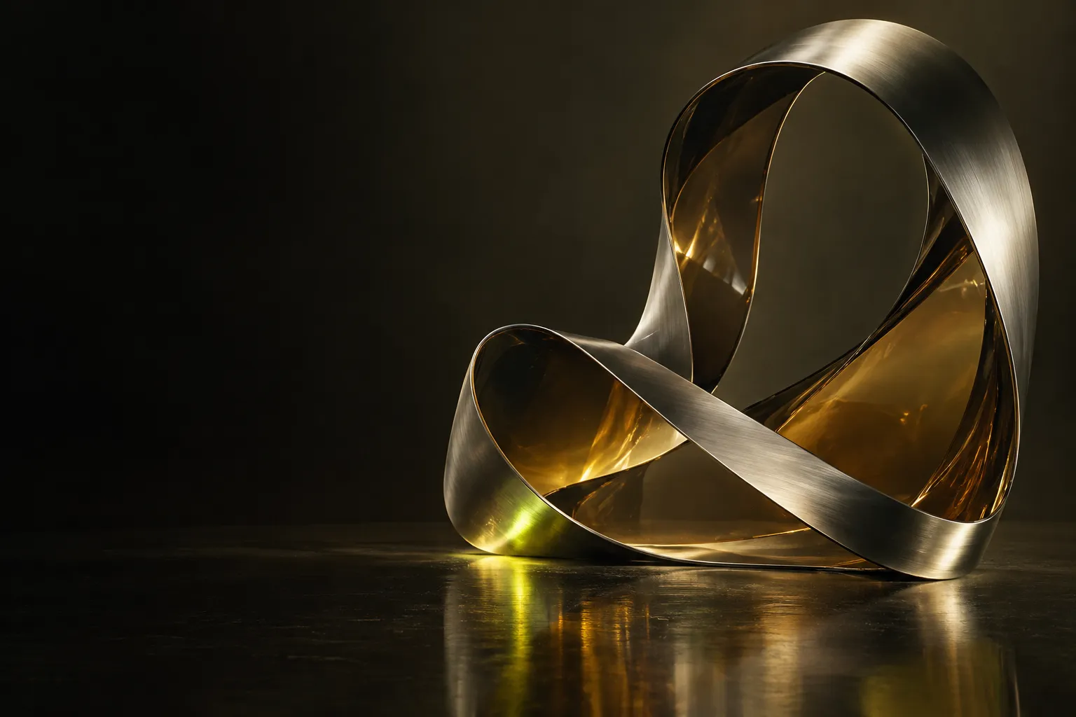
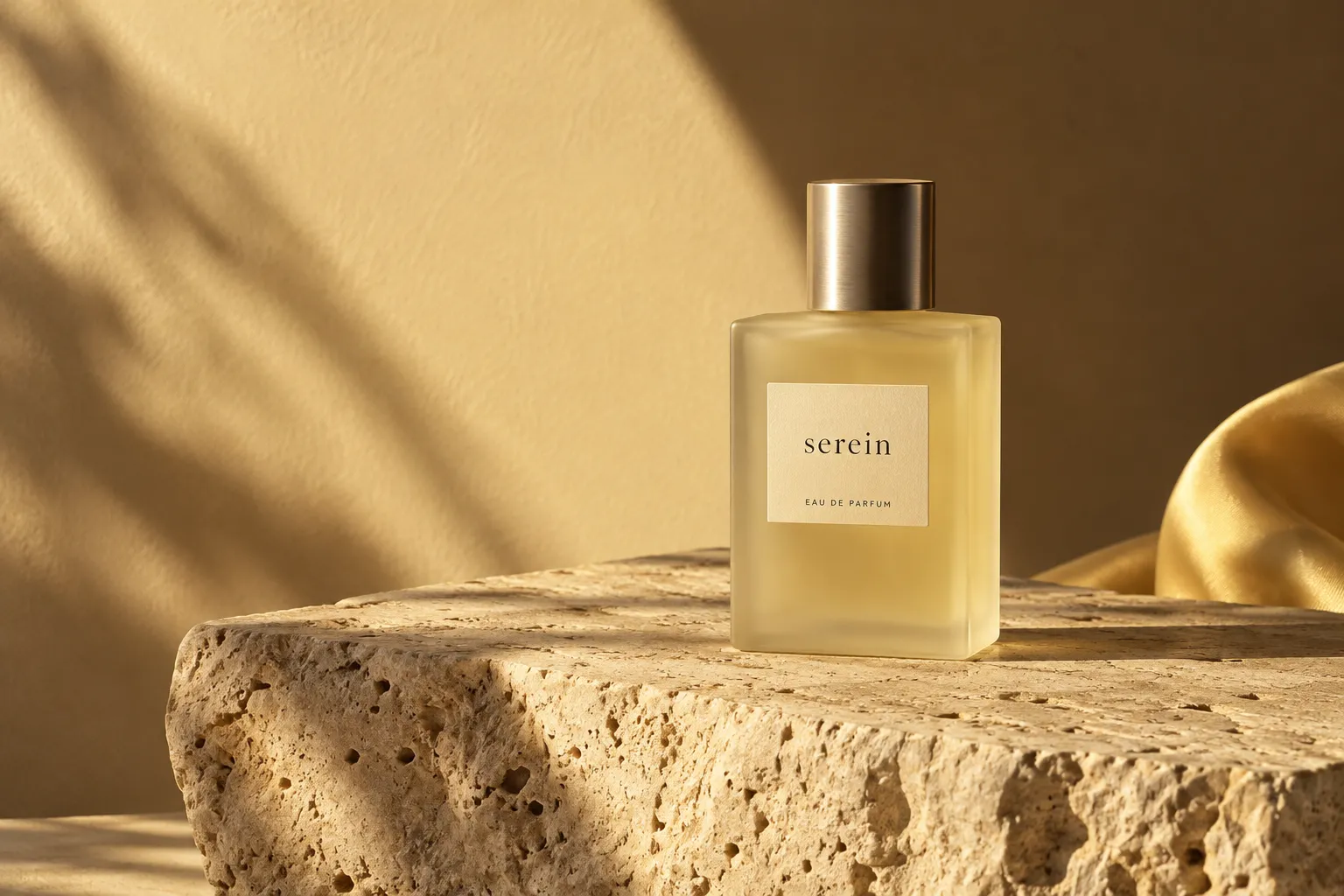
It is easy to mistake simplicity for the absence of work. In practice, a restrained design usually holds many decisions. A space left open. A line shortened. One colour kept and another set aside.
Start with what matters.
Before removing anything, we need to know what the work is trying to say. A clear intention gives us a useful measure: does this choice make the idea easier to understand, or does it compete with it?
For our Serein concept, the answer was a slower rhythm. The identity needed to feel considered without becoming distant. Warm light, tactile surfaces and expressive typography gave it character. Generous space allowed those details to be noticed.
Restraint works when the details have something to offer.
Give the eye a place to rest.
Visual hierarchy is a form of hospitality. It helps a reader understand where to begin, what belongs together and where to go next. We look for a rhythm between moments of emphasis and moments of quiet.
That rhythm is not a formula. A dense spread may need one calm margin. A quiet screen may need a surprising image. The useful question is how each part changes the experience of the whole.
Keep the character.
Editing should make an identity more itself. If every distinctive detail disappears, the work can become interchangeable. We keep the gesture that carries the idea: an unusual proportion, a particular material, a voice that sounds like a person.
- Make the central idea clear.
- Give important details enough space.
- Keep one gesture that feels unmistakably yours.
The result is not less for its own sake. It is a clearer relationship between what a brand means and what people see.