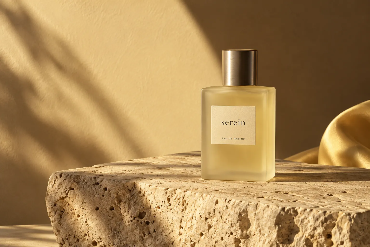
A brand is a set of choices. What it notices. What it leaves out. What it repeats until it becomes recognisable. The visual identity is where those choices begin to take shape.
Start with a question.
The first useful question is rarely “What should it look like?” We begin with what the brand makes possible for people. The answer gives the work a direction before colour, type or form enters the conversation.
“An identity becomes interesting when it has something to say.”
Make room for the in-between.
Early ideas are rarely complete. We sketch, rearrange and test them in different contexts. A useful detail can arrive from an unlikely place: the rhythm of a sentence, the shape of a shadow, the way a material catches the light.
Three things we keep coming back to:
- Be precise about the people you want to reach.
- Give a simple idea enough room to develop.
- Test the system in ordinary, everyday situations.

Give the idea a system.
The most useful identities can hold together and move at the same time. A clear typographic rhythm, a purposeful palette and a few distinctive gestures make space for variation without losing the central idea.
That is the space we like to work in: between a clear intention and the possibility of something we have not seen before.