
PROJECTS / CASE STUDY
Serein
A quieter kind of presence.
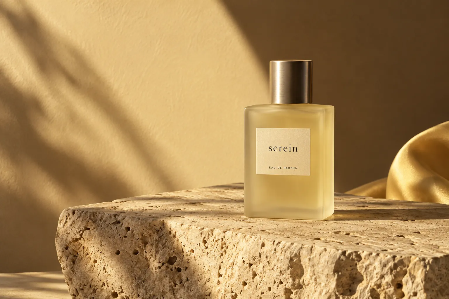
Serein
Brand identity
01 / THE CHALLENGE
Make space for a slower rhythm.
In a category that often asks for more, Serein imagines a fragrance brand built around less. Fewer distractions. More attention. An identity that lets a daily ritual feel considered.
02 / OUR APPROACH
Quiet, with a clear point of view.
We paired expressive serif typography with restrained layouts, tactile materials and warm light. The visual language gives the product room to breathe while bringing a distinctive rhythm to every touchpoint.
A DISTINCT POINT OF VIEW
Less, but closer.
NUVREN / BRAND WORLD
03 / THE RESULT
A complete world, held lightly.
A cohesive concept identity across packaging, digital and campaign imagery. A system made to stay recognisable, even when it speaks softly.
PROJECT DETAILS
THE WORK, IN FULLScope & deliverables
Brand positioning and creative direction Wordmark and visual identity system Packaging concept and campaign art direction Digital design direction
Credits & collaborators
Concept design and creative direction — NUVREN Visual assets — AI-assisted studio imagery Project type — self-initiated concept
CONTINUE EXPLORING
GO BEYOND THE EXPECTED.
All projects

STRATEGY · DIGITAL EXPERIENCE